Redesigning Australian smart thermostat's schedule feature
🌟Outcomes
-
Identified what's missing from the current product compared to major competitors
-
Developed two redesign concepts addressing missing elements in the "Schedule" function
-
Integrated hardware-specific exclusive relationships into the prototype.

📝 Overview
The first project completed in this internship was the design optimization for Midea's Australian smart thermostat's UX. My job focuses on finding what's missing from the current product compared to major competitors. Then, designing solutions that bridge that gap.
Role
Competitor Analysis
Wireframing & Prototyping
International collboration
Team
Product Manager
UI Designer
Front-end Engineer
UX Researcher
Tools
Figma
Miro
Word
📝 Problem discovery
Competitor analysis
(Product features)
The first analysis begins by evaluating the schedule feature in four products selling well in the Australian market, identifying five essential elements for optimization: customizable schedule names, AC settings, zone control, start/stop times, and weekday options.
%201.png)
List of essential features found in competitors' schedule feature
Competitor analysis
(Layout options)
The second part of the analysis delves into the presentation of the schedule feature on each smart thermostat product's user interface. Two distinct interactions were found as a result.
.png)
The carousel layout vs The one-page layout
Audit Existing Solutions
Lack of visual cues for hardware constraints: Through internal discussion, I highlighted that our current product doesn't account for mutual exclusivity. Specifically, for a smart thermostat, this refers to the interface's lack of guidance on which parameters cannot be adjusted when certain modes are active.
Key Learnings
Lack of zone control
Upon analysis, it was found that Midea's product hit every check box except for zone control.
Layout best practices
The carousel layout provides a less crowded interface and better looks, while the one-page layout offers quick access and easier navigation.
Visual cues are crucial to clarify hardware constraints
Adding visual cues to address hardware-specific exclusive relationships due to physical constraints is necessary to prevent user confusion.
🎨 Design Directions
-
Incorporating zone control
-
Creating a simple and streamlined user interaction
-
Helping users recognize, diagnose, and recover from errors
🧠 Ideation
Wireframing
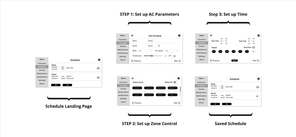
Adding zone control functionality
The competitor analysis suggests that adding zone control to the current schedule feature could provide a more complete solution.
Default state
Initially, I determined that up to eight zones can be displayed on the screen simultaneously. By default, all zones will be active to facilitate simpler overall HVAC management.
.png)
The wireframe of the zone control panel in the schedule feature
Updated user journey map
Adoption of the carousel layout
Integrated zone control expanded the interface, which led to increased scrolling. I developed the carousel layout wireframes that would help streamline user interaction.
.jpg)
Updated user flow after implementing zone control in the schedule feature
.jpg)
Updated user flow with wireframes
Visual Cues
Help users recognize, diagnose, and recover from errors
Upon discovering that fan speed and zone control cannot be altered in auto mode, I implemented a disabled state over these two panels to visually indicate their mutual exclusivity to users. Similarly, I added a filter to the temperature panel when it's in fan mode because it's nonadjustable.

EX: Fan speed is nonadjustable during auto mode
🎯 Final deliverable
.png)
Finalized user journey map with the addition of "zone control"
.png)
Before
-
The schedule feature lacks zone control
-
The interface didn't provide visual cues that help users recognize system conflict
After
-
Implementing zone control in the schedule feature to fill the missing piece
-
Adding disabled state (gray filters) to help users recognize nonadjustable parameters
🏅 Reflection
Self-study in free time to grasp HVAC basics
One of the biggest challenges I encountered during my internship was my initial lack of HVAC knowledge. During the first couple of team meetings, I was having a hard time understanding the discussion because I didn’t know what some of the technical jargon stood for. So, aside from fulfilling my responsibilities, I spent some free time looking up the terms and got myself familiar with the basic knowledge of HVAC systems.
Faced hardware analysis challenge; overcame by using online resources
A significant hurdle I encountered was performing competitor analysis for hardware products like smart thermostats. My background is primarily in analyzing software products and websites, a task made simpler by the ability to download an app or visit a website for direct interaction. However, lacking physical access to a competitor's product posed a challenge. To tackle this, I turned to online resources, reviewing user manuals to grasp the user interface and features of these products. Additionally, I utilized YouTube videos to gain insights into the user journey and detailed interactions.
🔁 Iteration
Solicit feedback within a product team
I put everything into a 10+ page Detailed documentation on the functionalities and sent it to other peers in the project team. Following their review, they provided feedback directly in the document, serving as references for further iterations.


Collect peer feedback and propose design iterations
Successful application of zone control ✅
Implementing zone control into the schedule makes the product more comprehensive.
Carousel layout posts UX Challenge ❌
Information segmentation could improve the look, but sacrifice easier information recall because users need to jump back and forth to review input
Carousel layout brings heavy workload ❌
Transforming the layout completely changes the front-end framework, which adds a heavy workload to the development team.
Adopting the one-page layout: After communicating with cross-functioning parties within the group, I opted to retain the original one-page layout instead of the carousel design
.png)
The transition from the carousel layout to the initial one-page layout
